
October 12, 2026 / 4 min read
One Streaming Button or Several? Testing Landing Page Choices
A decision framework for choosing one primary streaming action or several platform options without turning a release page into a maze.
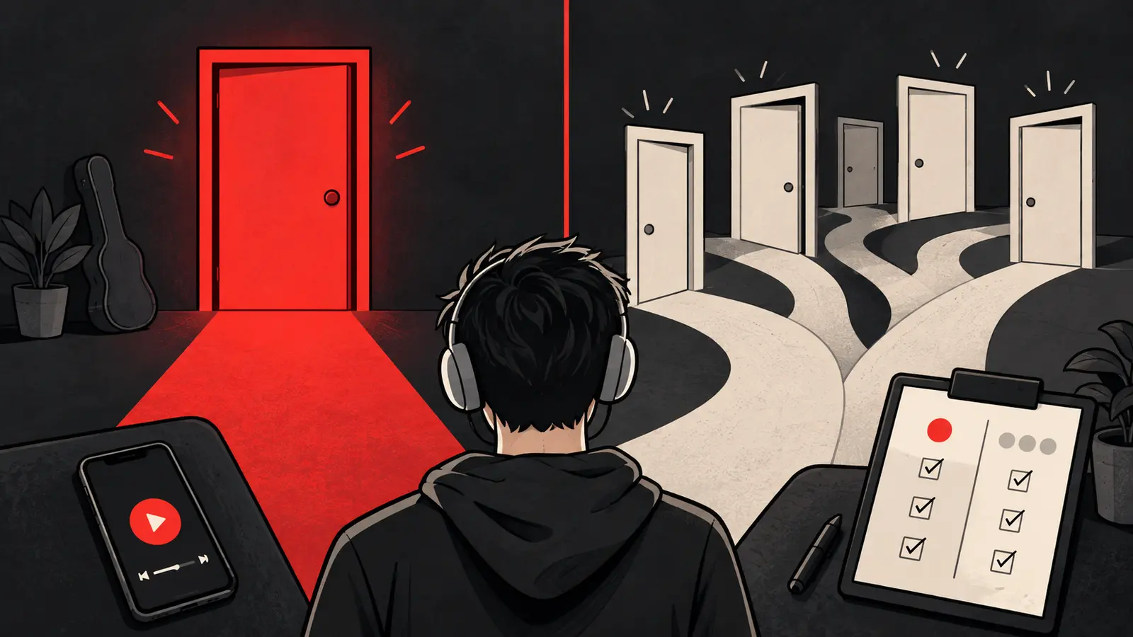
The most important button on a music landing page is often the one that opens the listening destination. The question is whether that page should show one primary streaming button or several services at once. There is no universal winner. The answer depends on the campaign objective, audience, market and measurement setup.
The mistake is to add every possible destination before deciding what the visitor needs. More choice can increase access, but it can also slow the decision and make the page harder to understand.\n\nBefore you compare the layouts, write down what success means for this campaign. You might want more completed listening actions, fewer abandoned visits, a clearer picture of platform preference, or a better handoff into a fan signup. The page structure should answer that question. Otherwise, you may celebrate more clicks even though the extra choices made the next step less clear.
Start with the campaign objective
Choose the page structure after defining the action you are trying to create. A single-platform campaign may be built to learn how a specific audience responds to a Spotify release. A broader release campaign may need to let people choose Spotify, Apple Music, YouTube Music or another service. A fan-capture campaign may prioritize an email or WhatsApp opt-in before the streaming choice.
Write the objective in one sentence:
“We want qualified people who recognize this song to start listening on the service they already use.”
Then ask whether one button helps that happen or hides an important choice.
When one primary button makes sense
A single button is often easier to understand when:
- The campaign is intentionally focused on one streaming platform.
- The audience and market are likely to use that platform.
- You need a short path from click to listening action.
- The test question is about the ad or audience, not platform preference.
- You can still offer other services lower on the page for visitors who need them.
The button should identify the destination clearly. “Open Spotify” tells the visitor what will happen. “Listen now” may be warmer, but it can be ambiguous if the next screen is another choice page.
One button does not mean one rigid experience. You can include a secondary “Other ways to listen” link, but keep the hierarchy visible.
When several buttons are useful
Several choices can be the better experience when:
- The release is being promoted across markets with different listening habits.
- The campaign reaches both existing fans and new people.
- The artist has a meaningful audience on multiple services.
- A direct route to one platform would exclude a large part of the audience.
- The campaign’s goal is broad release access rather than a single-platform measurement test.
The layout still needs a clear order. Put the most relevant option first only when you have a reason supported by audience or campaign context. Do not pretend that your top button is objectively the best service for everyone.
Do not confuse link architecture with attribution
A multi-platform page may tell you which button a visitor clicked, depending on the tool and implementation. It usually cannot prove that every later stream came from that click. A direct link may shorten the journey, but it does not automatically make downstream listening fully attributable.
Our guide to Spotify ad clicks versus streams explains the difference between the events you can observe and the conclusions you should avoid. For a broader comparison of route length and platform choice, see Spotify smart links versus direct links.
A clean test design
If you want to compare one button with several, choose one question and hold the rest steady. For example: “Does giving visitors platform choice increase the rate of a streaming-button action without reducing the quality of the traffic?”
Keep stable:
- Ad creative and copy.
- Audience definition.
- Campaign dates and budget rules.
- Song, cover art and page load behavior.
- Tracking parameters and reporting window.
Change only the page choice structure. If you change the creative, audience and destination at the same time, you will not know what caused the difference. The small-budget creative testing guide uses the same principle: decide what you want to learn before spending.
What to record
Report the steps separately:
| Measurement | Use it to answer |
|---|---|
| Landing-page views | Did the destination load? |
| Primary button clicks | Did visitors take the intended next step? |
| Button mix | Which service choices were selected? |
| Cost per observed action | How expensive was the measured step? |
| Downstream platform data | Did listening change in the same period? |
Do not turn a lower cost per click into a claim about better listeners without supporting evidence. Read the page data alongside the platform data, with the reporting dates clearly labeled.
The practical compromise
For many campaigns, the strongest starting point is one visually primary streaming action plus a small, clearly labeled set of alternative services. That gives the page a default path without locking every visitor into it. The structure can evolve as you learn where the audience actually listens.
The best landing page is not the one with the most buttons. It is the one that gives the right visitor a confident next step. If you need help testing that decision on a real release, work with Shuffle.
Want this run on your release?
We take on a limited number of artists and labels, and we read every application ourselves.
Apply to Work With Us