
October 12, 2026 / 4 min read
Why Fans Leave Your Smart Link Before Opening Spotify
A diagnostic guide to the moment between the ad click and the streaming service, where extra choices, slow pages and weak context can lose a potential listener.
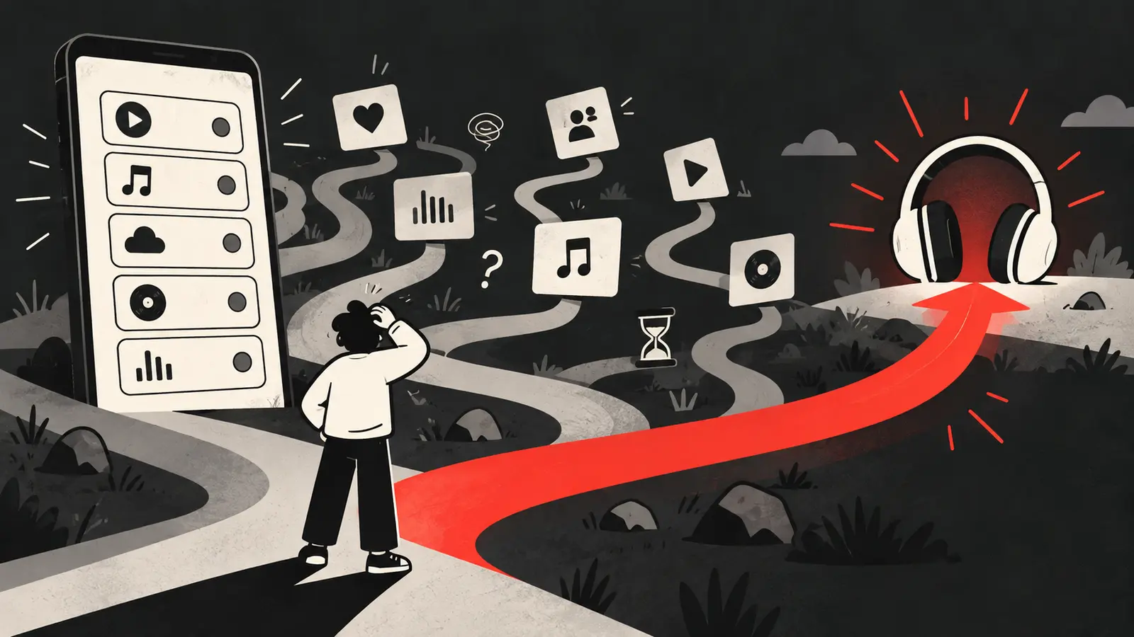
A smart link can solve a real problem: one campaign may reach people who use Spotify, Apple Music, YouTube Music or another service. But every extra screen and decision creates another place for a visitor to leave. If people click the ad but few open a streaming destination, treat the smart link as part of the funnel that needs diagnosis.
This is different from asking whether smart links or direct links are better in general. The right question is: what happened on this page, for this visitor, after this ad?
The first problem: the page does not look connected to the ad
A visitor should recognize the song and artist immediately. If the ad showed a close-up performance and the smart link opens with a generic logo, a stock background or an unrelated release, the visitor has to rebuild trust. Some will leave before reading the buttons.
Compare the ad and destination side by side:
- Is the artist name spelled the same way?
- Does the cover art or video frame match the release?
- Does the headline repeat the song or campaign promise?
- Does the page load the intended release rather than the artist’s full catalogue?
Message match does not mean copying the ad word for word. It means reducing the doubt that the click led to the wrong place.
The second problem: too many choices arrive too early
A smart link may show several services, social profiles, mailing-list fields, a biography, merch and unrelated releases. That can be useful for an artist hub, but a paid single campaign has a narrower job. If the main decision is to listen, make the listening choices visually dominant and move everything else lower.
Try a simple hierarchy:
- Confirm the song and artist.
- Show the primary listening options.
- Offer one short reason to continue.
- Put secondary actions below the listening decision.
If every button has equal size and weight, the visitor has to do the sorting. The page should do more of that work.
The third problem: the page is slow or unstable
A link can be technically correct and still feel broken. Large cover art, multiple tracking scripts, video embeds and redirect chains can delay the first useful screen. A visitor who is willing to wait for a song may not be willing to wait for a blank page.
Test the link on mobile data, in a private browser window and from the same countries you are targeting. Watch for:
- A blank or nearly blank first screen.
- A loading spinner with no clear end.
- Layout shifts that move the button while someone taps.
- A consent banner covering the service choices.
- Redirects that open the wrong app or browser tab.
Google’s Core Web Vitals guidance focuses on loading, responsiveness and visual stability. It is written for the web overall, but the same problems matter in a paid listening journey because they make the next action harder to complete.
The fourth problem: the buttons do not explain what happens next
“Continue” is less informative than “Open Spotify.” A visitor should know whether a tap will open an app, a browser page or another selection screen. Use concise labels and make the tap target large enough to find quickly.
Do not use fake urgency or imply that a click guarantees a playlist placement, algorithmic result or career outcome. A clear button earns more trust than an exaggerated promise.
The fifth problem: the campaign is sending the wrong kind of click
A compelling clip can attract curiosity from people who enjoy the video but are not looking for a new artist to hear. That does not mean the creative failed. It means the click and listening intent may not be aligned. Compare the promise, the audience and the destination before making a conclusion.
Our article on music ad clicks versus listener growth lays out a sequence for separating tracking problems from audience and offer problems. You can also review how to choose a song hook for a music ad when the opening moment is generating attention without enough qualified interest.
Build a drop-off report instead of guessing
Track the steps that your tools can observe. A simple report might include:
| Step | What it tells you |
|---|---|
| Ad link click | Someone activated the destination from the ad |
| Landing-page view | The destination loaded enough to register a view |
| Streaming-button click | Someone selected a listening route |
| Streaming destination | Which service or platform was selected, if available |
| Signup or return action | Whether the page created an owned next step |
These are not interchangeable measurements. A button click is not automatically a stream, and a stream cannot always be attributed to one ad click. Use the names your tools actually support and document the gaps.
When should you simplify the link?
Simplify when the campaign is deliberately focused on one platform, the audience is already likely to use it, or the additional choices create measurable abandonment. Keep multiple options when platform choice is essential or when you are learning where the audience prefers to listen.
Make the decision with a controlled test when possible. Keep the creative, audience and dates stable, then change one destination experience. The goal is not to force every visitor through the same path. It is to learn which path helps the right people take the next action.
If you want an experienced team to review the whole journey from ad to listener, contact Shuffle.
Want this run on your release?
We take on a limited number of artists and labels, and we read every application ourselves.
Apply to Work With Us