
October 12, 2026 / 5 min read
How to Test a Music Landing Page on Mobile
A repeatable mobile QA process for checking the first screen, tap targets, loading behavior, redirects, tracking and the complete path to listening.
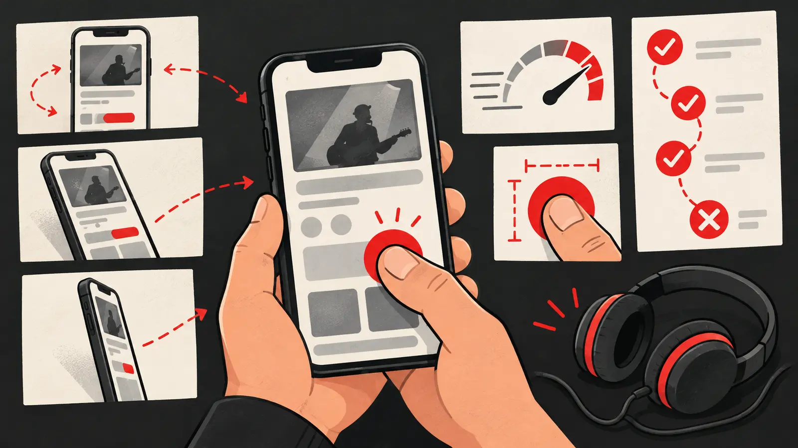
A music landing page can look perfect on a laptop and still lose visitors on a phone. The headline may wrap badly, the listening button may sit below an oversized image, or a redirect may open the wrong destination. These are not minor details when the campaign begins in a mobile feed.
Test the exact journey a paid visitor will take: tap the ad, wait for the page, understand the release, choose a listening action and return if the first route does not work.
Start with a clean mobile session
Open the page on a real phone when possible. Also test a private browser window so a saved login, cached image or existing consent choice does not hide a problem. Use the same type of connection your audience may have, including mobile data rather than only fast Wi-Fi.
Record the test date, device, browser, location and URL parameters. You do not need a complicated lab report. You do need enough context to reproduce a failure.
Check the first screen
Before scrolling, a visitor should be able to identify the artist, song and next action. The page does not need to show every detail immediately, but it should not make the visitor guess what the page is for.
Check:
- The artist and song title are readable.
- The opening image or video loads without hiding the message.
- The primary listening button is visible or clearly signposted.
- The text does not collide with the screen edge.
- The ad promise and landing-page message feel connected.
Use the music landing page checklist when the first screen is difficult to judge.
Test every tap with a thumb
Do not only click with a mouse or trackpad. Tap the buttons as a mobile visitor would. Confirm that the target is easy to hit, that the whole button behaves consistently and that a nearby element does not steal the tap.
Test the complete set of actions:
- Primary streaming button.
- Alternative streaming services, if shown.
- Video or preview player.
- Signup, contact or fan update action.
- Back navigation to the landing page.
If a visitor opens an external app and returns, the page should still be understandable. Do not assume the first tap will always open the same app for every person.
Watch what loads before the button
The page should prioritize the information required for the next decision. Large background videos, multiple embeds and unnecessary scripts can delay the useful part of the experience. Compress images, avoid loading content that is not needed above the fold and check whether a third-party widget blocks interaction.
Google’s Core Web Vitals documentation describes loading performance, responsiveness and visual stability. Its thresholds are not a music advertising benchmark, but the underlying checks are valuable: does the content appear quickly, respond to interaction and stay in place while it loads?
Check layout stability
Begin loading the page and watch the area around the primary action. If the button moves after an image, font or consent banner arrives, a visitor can tap the wrong element or give up. Reserve space for media, load fonts carefully and make the consent experience compatible with the page’s main action.
Google’s mobile-first guidance also recommends keeping the important content and metadata equivalent across mobile and desktop versions. See Google’s mobile-first indexing best practices for the search-side explanation.
Verify redirects and tracking
Use a test URL with the campaign parameters you plan to send. Click every listening route and confirm:
- The correct song opens.
- The artist identity remains clear after the redirect.
- The destination is secure and not broken.
- The parameters are preserved where your measurement setup expects them.
- The event you report actually fires once, not multiple times.
A landing-page view, button click and stream are separate events. The Spotify clicks versus streams guide explains why reports should keep those labels separate.
Test the page with the copy hidden
This is a useful visual exercise: look only at the hierarchy of the page. Can you tell which action is primary? Are all the buttons competing? Does the cover image communicate the release or distract from it? If the page needs a paragraph to explain what to tap, the design may be doing too little work.
Then read the copy normally and check whether it answers the basic questions:
- What is this release?
- Why might it be relevant to me?
- What happens when I tap?
- Is there another way to listen if the first option is not mine?
Compare devices, not just screen sizes
Two phones with similar dimensions can still behave differently because of browser version, font rendering, connection speed and app-handling rules. Test at least one iPhone and one Android device when those audiences matter. If you cannot access both, use a responsive emulator as a first pass and mark the real-device check as a launch requirement.
Save a short QA record
A useful record can fit in a table:
| Check | Result | Notes |
|---|---|---|
| First screen | Pass / fix | Is the song and action clear? |
| Mobile load | Pass / fix | Any blank or delayed area? |
| Tap targets | Pass / fix | Can every button be tapped easily? |
| Redirects | Pass / fix | Does each route open the right release? |
| Tracking | Pass / fix | Are events named and firing once? |
| Return path | Pass / fix | Is the page still understandable after returning? |
Run the check again after changing the page. A new image, script or consent setting can reintroduce a problem that was already fixed.
Mobile QA is not a cosmetic step. It is how you find the gap between a page that technically exists and a page that a real listener can use. If you want help testing the landing page inside a full paid music campaign, contact Shuffle.
Want this run on your release?
We take on a limited number of artists and labels, and we read every application ourselves.
Apply to Work With Us